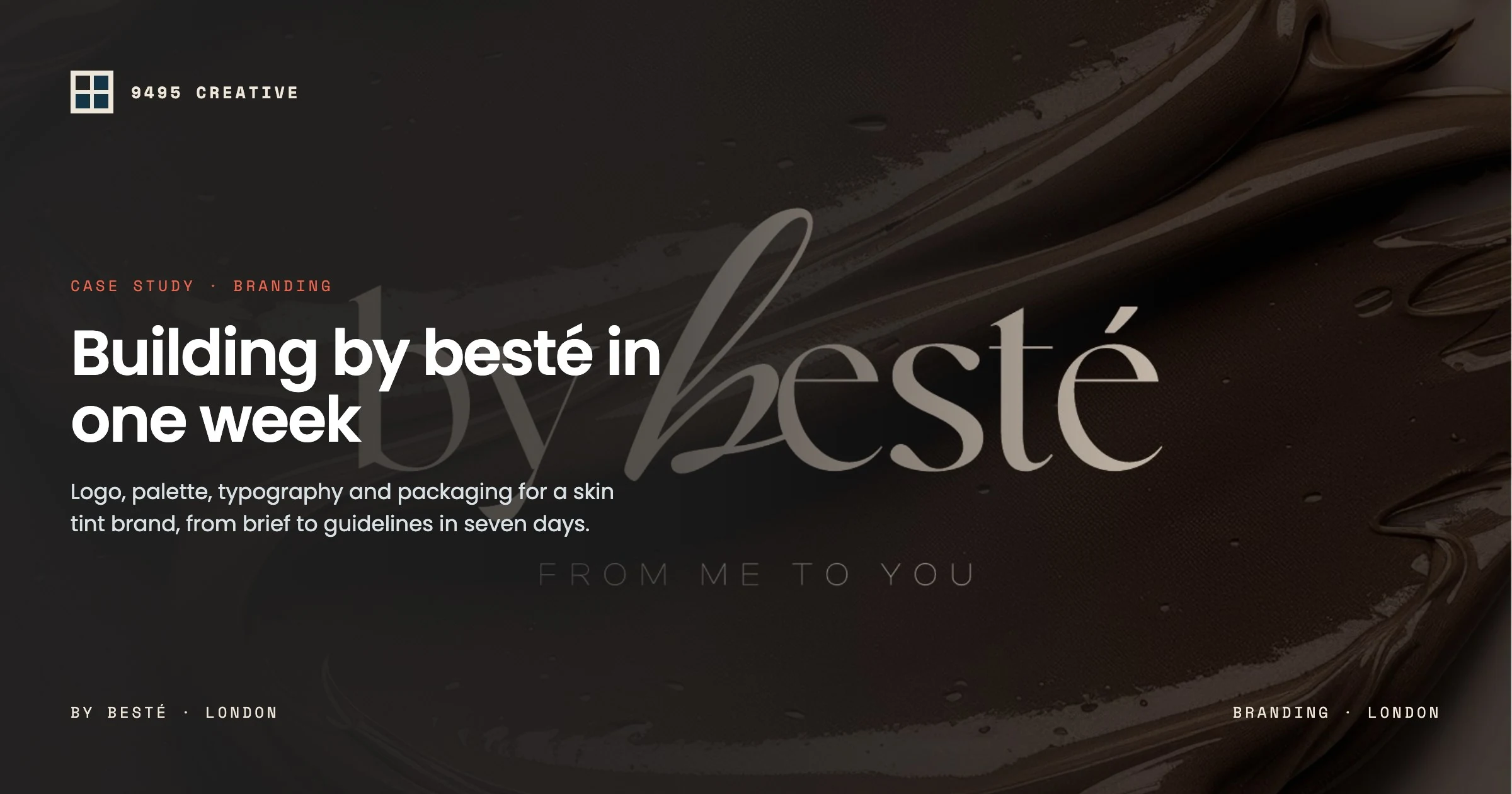
Beauty is one of the most crowded categories on the shelf and on the feed. A new skincare or make-up label has a few seconds to feel trustworthy, desirable and distinctly its own. This case study walks through how we built the brand identity for by besté, a skin tint brand, from the first concept to packaging-ready guidelines, delivered within one week of receiving the brief.
If you are launching a cosmetics brand and wondering what goes into a proper identity (and why it matters), this is exactly how we approach it at 9495 Creative.
The brief: understated, accessible luxury
by besté’s hero product is a lightweight, water-based skin tint. The founder wanted a brand that felt premium without feeling cold or out of reach. It needed to be warm and personal, and quietly confident rather than loud.
That gave us three guiding words for the whole project: fluid, warm, intimate. Every decision that followed was tested against them.
The logo: inspired by the product itself
The wordmark pairs a refined serif with a hand-drawn, flowing b. That fluid letterform is inspired by the lightweight, water-based texture of the skin tint. It reads like a single brush stroke of product across the skin.
The strapline “From Me to You” adds the personal touch. It turns a product into a gift and a founder’s promise, which is exactly the emotional note a beauty brand needs.
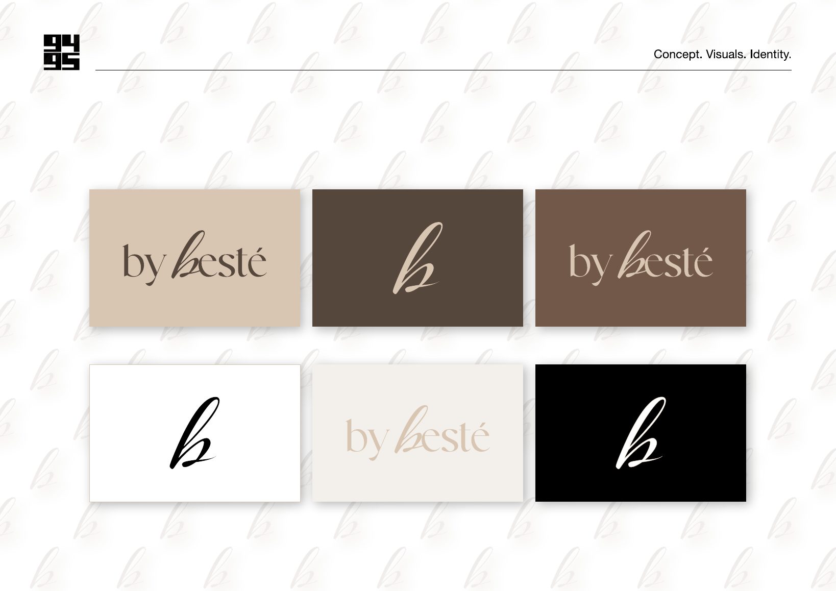
We designed the b to work on its own as a monogram. It is ideal for bottle caps, social avatars, stickers and small packaging details where a full wordmark would be too busy.
The colour palette: skin, cocoa and cream
For a complexion product, colour is not decoration; it is the product. We built the palette around real skin and texture tones:
- Cream #F5F0EA: the clean, airy base for backgrounds and packaging
- Sand #DDC5B0: the signature skin tone, used for the logo on dark grounds
- Cocoa #775747: warmth and depth for secondary elements
- Espresso #59463B: the anchor colour for text and premium dark layouts
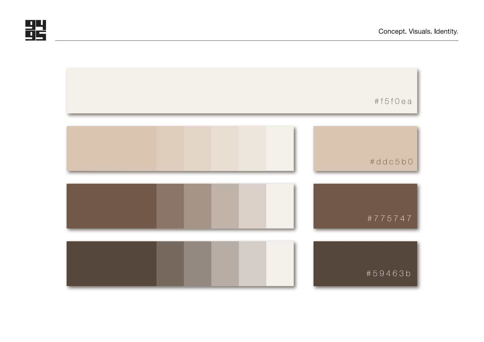
Each colour comes with a full tint scale, so designers and printers can build layouts without guessing. The result feels cohesive whether it appears on a bottle, a website or an Instagram grid.
Typography: elegant headlines, easy reading
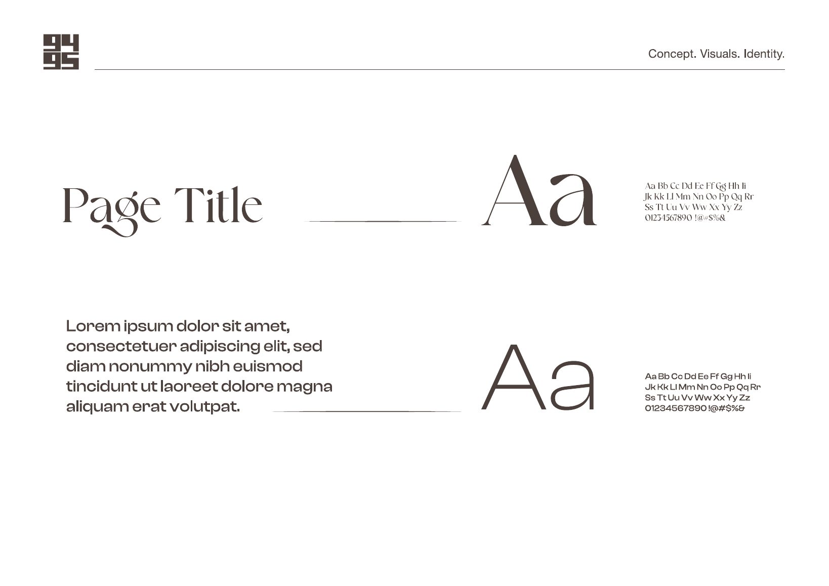
We paired a high-contrast serif for headlines with a clean, modern sans-serif for body copy and product information. The serif carries the elegance; the sans-serif keeps ingredient lists and captions legible at small sizes, which matters on cosmetics packaging.
Tone and mood: soft light, fluid texture
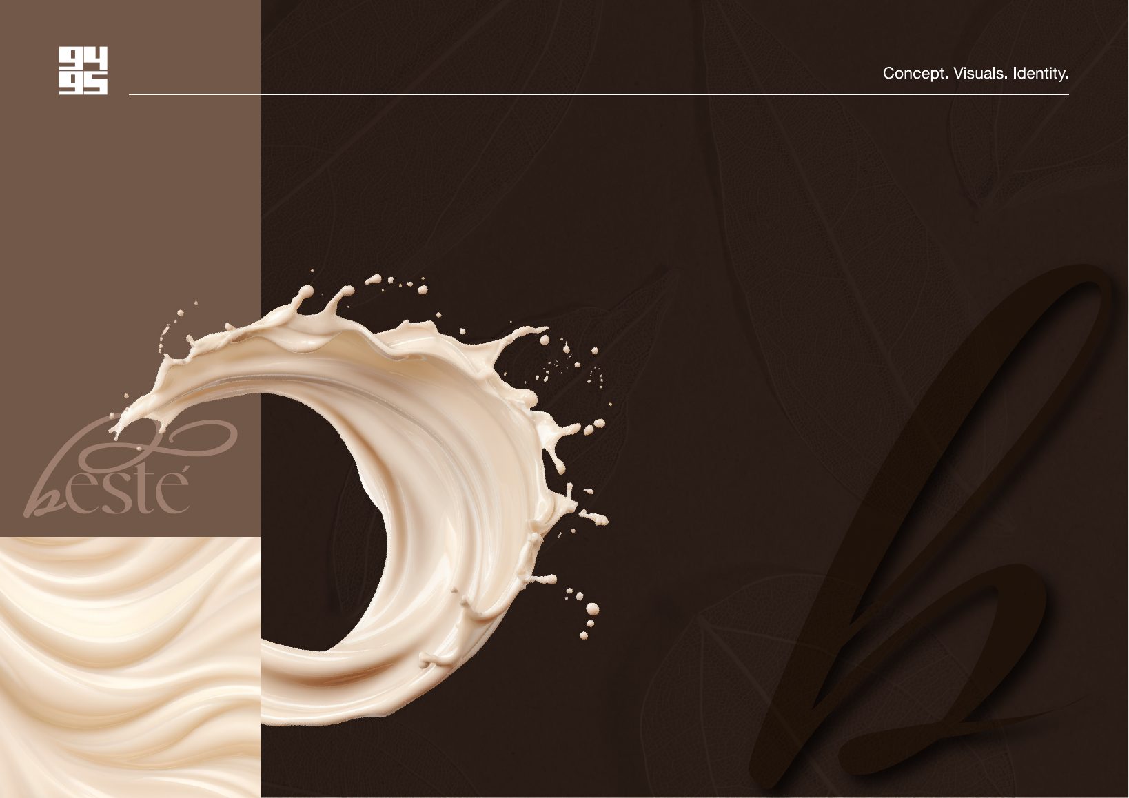
A strong identity is more than a logo. We defined the visual mood for photography and campaigns: soft natural shadows, creamy textures and water movement echoing the product’s lightweight formula. This gives future photographers and content creators a clear direction to follow.
Bringing it to life on packaging and print
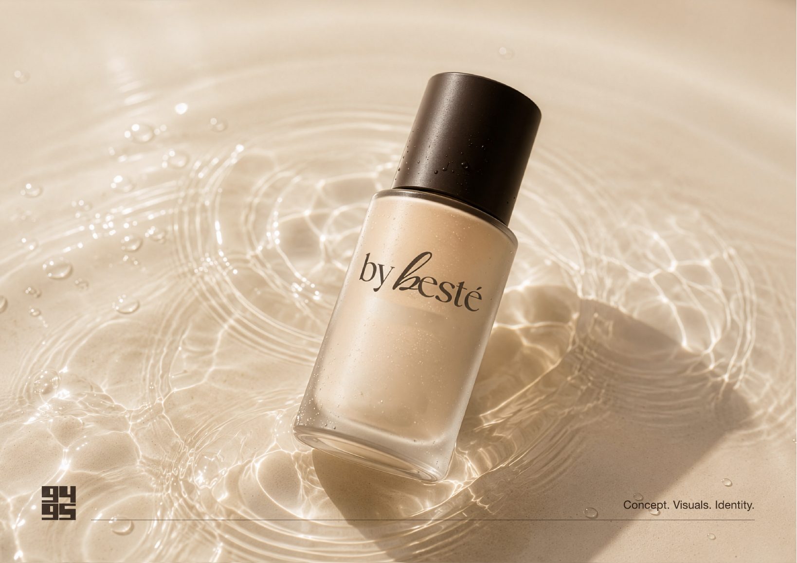
Finally, we tested the identity where customers will actually meet it: on the bottle, on packaging and in the unboxing moment.
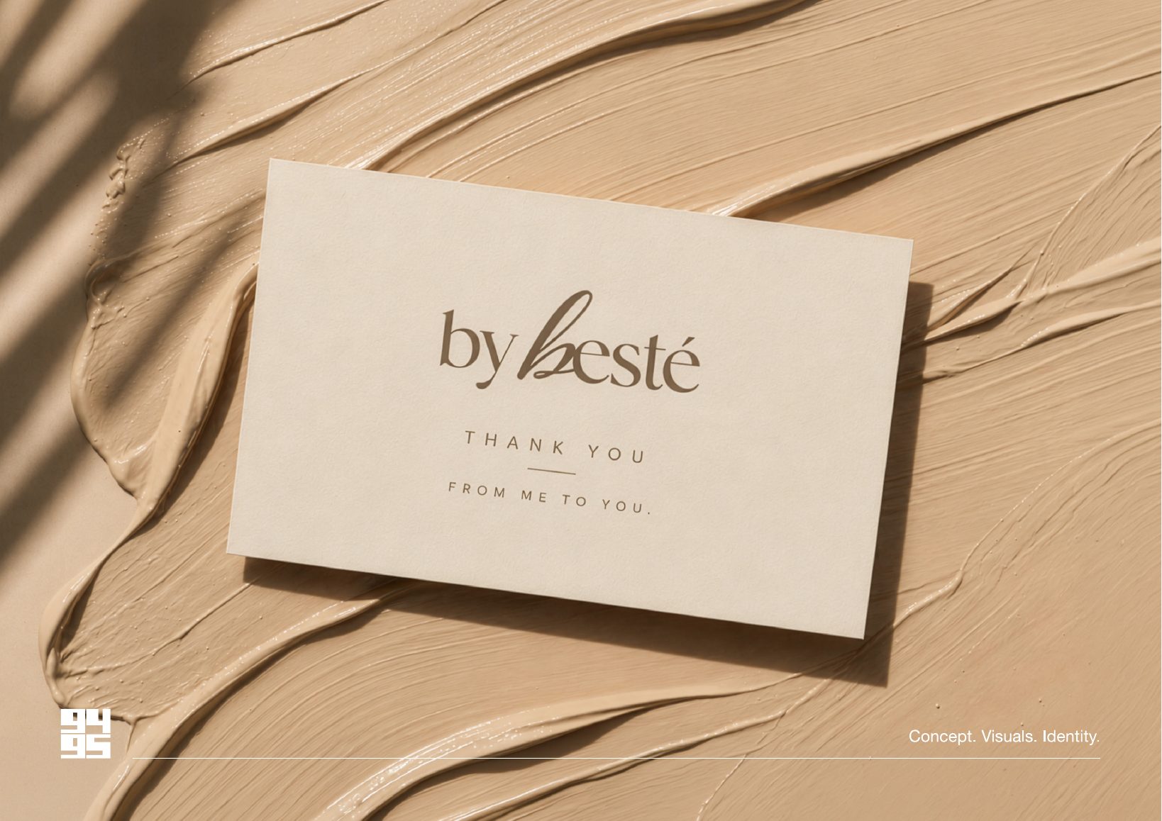
Small touches like the thank you card matter enormously for direct-to-consumer beauty brands. It is often the moment a customer decides whether to post about you.
What beauty founders can take from this project
- Start with the product’s texture and feeling. The best beauty identities borrow directly from what the product does on the skin.
- Build a system, not just a logo. A monogram, a colour scale and a type hierarchy save you time and money on every future launch.
- Design for the small moments. Caps, stickers, cards and social avatars are where consistency is won or lost.
- Write the guidelines down. Clear rules let freelancers, printers and agencies work with your brand without diluting it.
If you’d like to understand how the pieces fit together, read our guide to what a brand identity system includes. Weighing up who to hire? Our comparison of branding agencies vs freelancers will help.
Launching a beauty brand in London?
9495 Creative is a London creative studio working across branding, video and content. We can take you all the way from logo to launch campaign with product photography and social content.
Tell us about your brand and get a quote →
Frequently asked questions
How long does it take to create a cosmetics brand identity?
Typically around one week once we have your brief and brand information. We delivered the complete by besté identity within a week. Larger ranges with extensive packaging may take a little longer.
What should a beauty brand identity include?
At a minimum: a primary logo and alternative marks, a colour system with exact hex values, a typography pairing, tone of voice and mood direction, and mock-ups showing how it all works on packaging, print and social media.
Do you work with beauty start-ups outside London?
Yes. We are based in London but work with brands across the UK and internationally. Discovery calls and presentations work perfectly well remotely.
1 comment